

CASE 05 / 05 · 2022–23 · iOS + ANDROID
GlobeSisters · Women-only homestay community
Turning sign-ups into trusted stays.
GlobeSisters is a women-only homestay community. I led the redesign of onboarding, discovery and trust so new members actually reach out, ideally in their very first session.

Problem
GlobeSisters is a safe traveling community for women. Yet new members signed up, then left before messaging a host.
What I did
Led research and prioritization, and redesigned onboarding and discovery around one goal: a safe first message in the first session.
Impact
35%
easier to use
35% easier to use and 20% less checkout abandonment after the redesign. In testing, 4 of 5 people used Profile Preview and List View.
Problem
Women were signing up, then leaving before they ever contacted a host.
Mapping the first session as a funnel showed where it broke. Sign-up worked. Everything after it asked new members to trust strangers they knew nothing about.
01
Sign up
Worked: fast and simple
02
Understand the product
Unclear: what is this, is it safe?
03
Find a host
Slow: map only, no search
04
Trust her enough to message
Where members dropped off
For a marketplace, no first message means no stays, no reviews and no new hosts.
Research
With little data, I went to where the members were.
Six methods, from a first audit of the live app to research after launch.
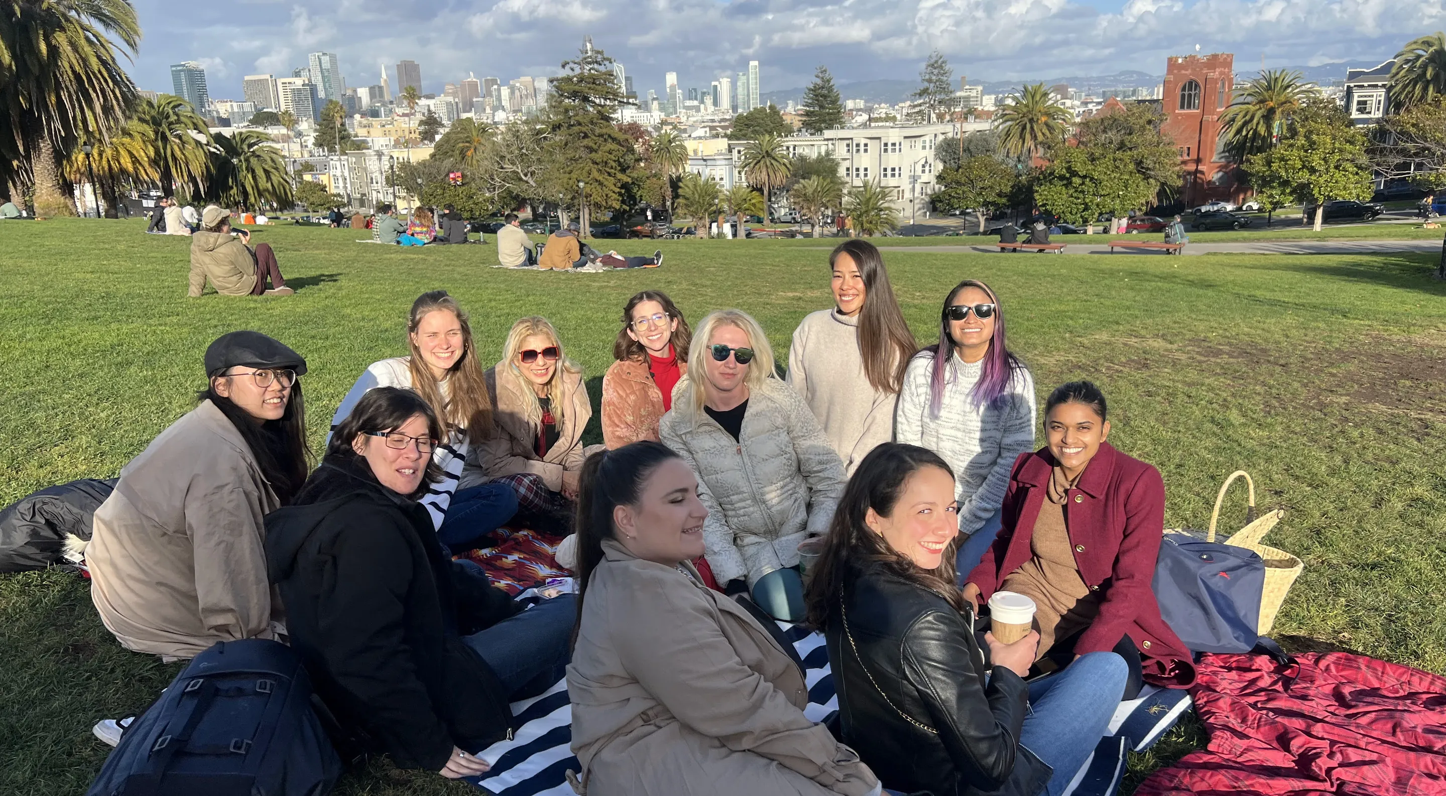
Community meetup, San Francisco
Insights
Joining was easy. Trusting someone enough to reach out was not.
01
Connecting is the hard part
Members struggled to reach out. After launch, research with a competing app showed the same: many were still looking for someone to meet, and messages went unread.
Interviews, confirmed by research after launch
02
No idea what it was
“As a first-time user, I was unsure what it was about.”
Early usability testing → onboarding
03
The map said too little
“There’s not a lot of info in the map view except for the location.” Members couldn’t tell who was hosting.
Beta testing → discovery
04
Safety can’t wait for the review
“If something really bad happened… having the option to report the user.”
All 3 beta testers raised it → safety tools
What we heard

Photo: “Lion Rock Hill” by Tommy Chau, CC BY
Flows and wireframes
Every path ends at a first message, not just a profile.
The winning ideas became one flow with three ways in: tap a face, switch to a list, or search and filter. Each path passes a trust check before the ask, and the goal is a first message, by chat or a request to stay. Crazy 8’s sketches then turned it into gray-box wireframes I tested with users.
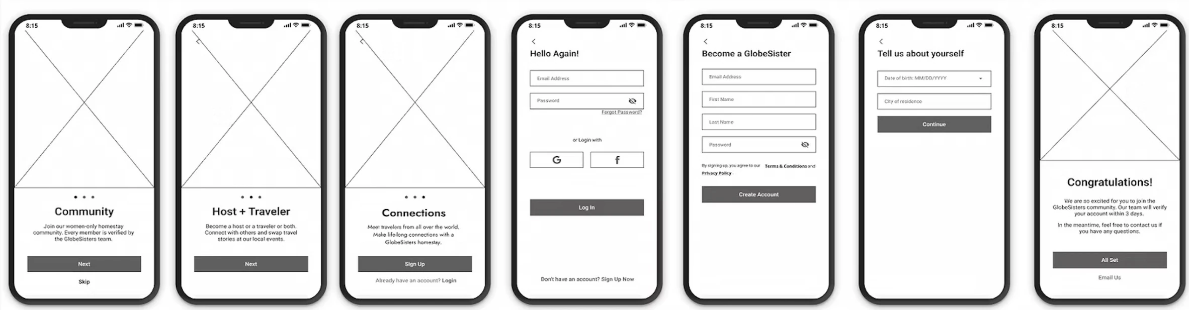
The redesigned flow, then onboarding and sign-up wireframes in Figma, tested before visual design.
Decision 01 · Onboarding
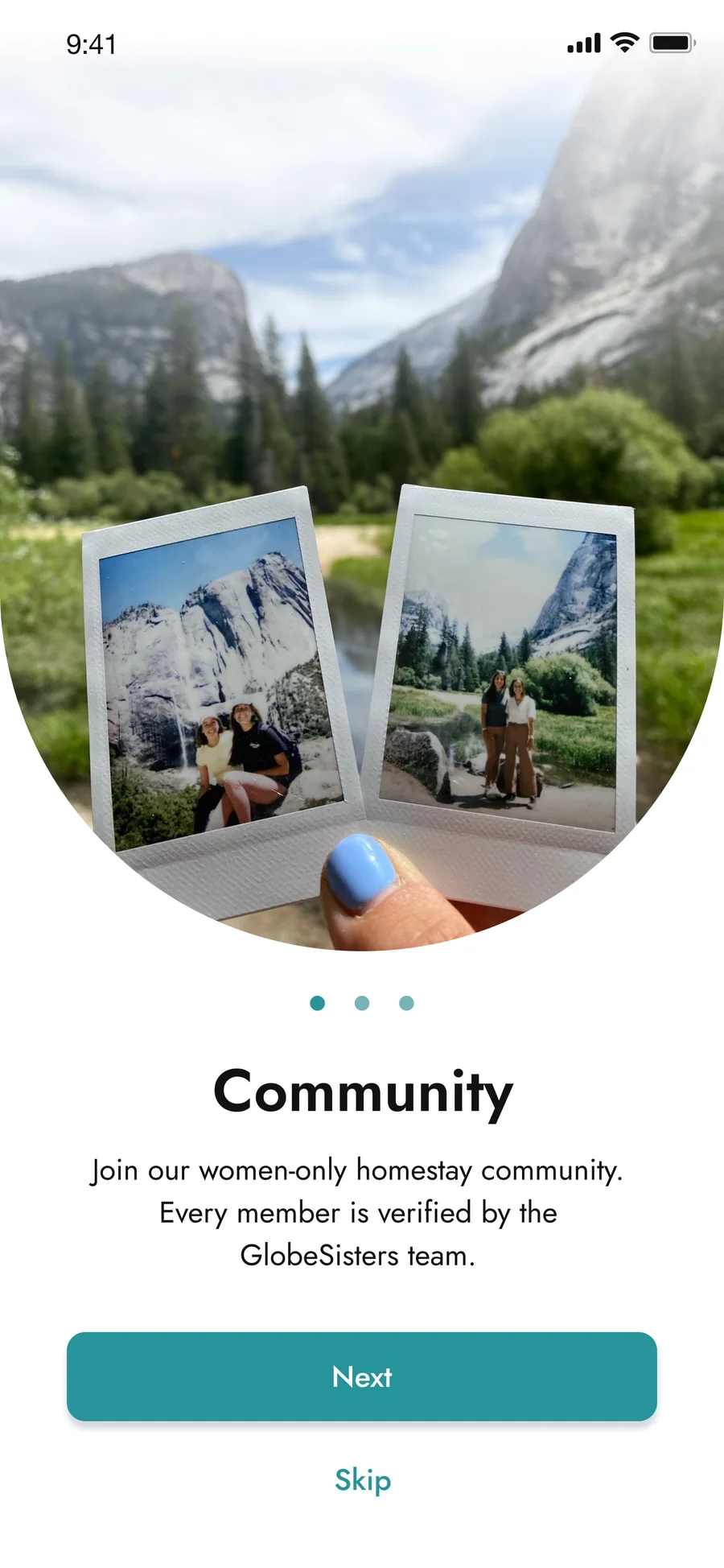
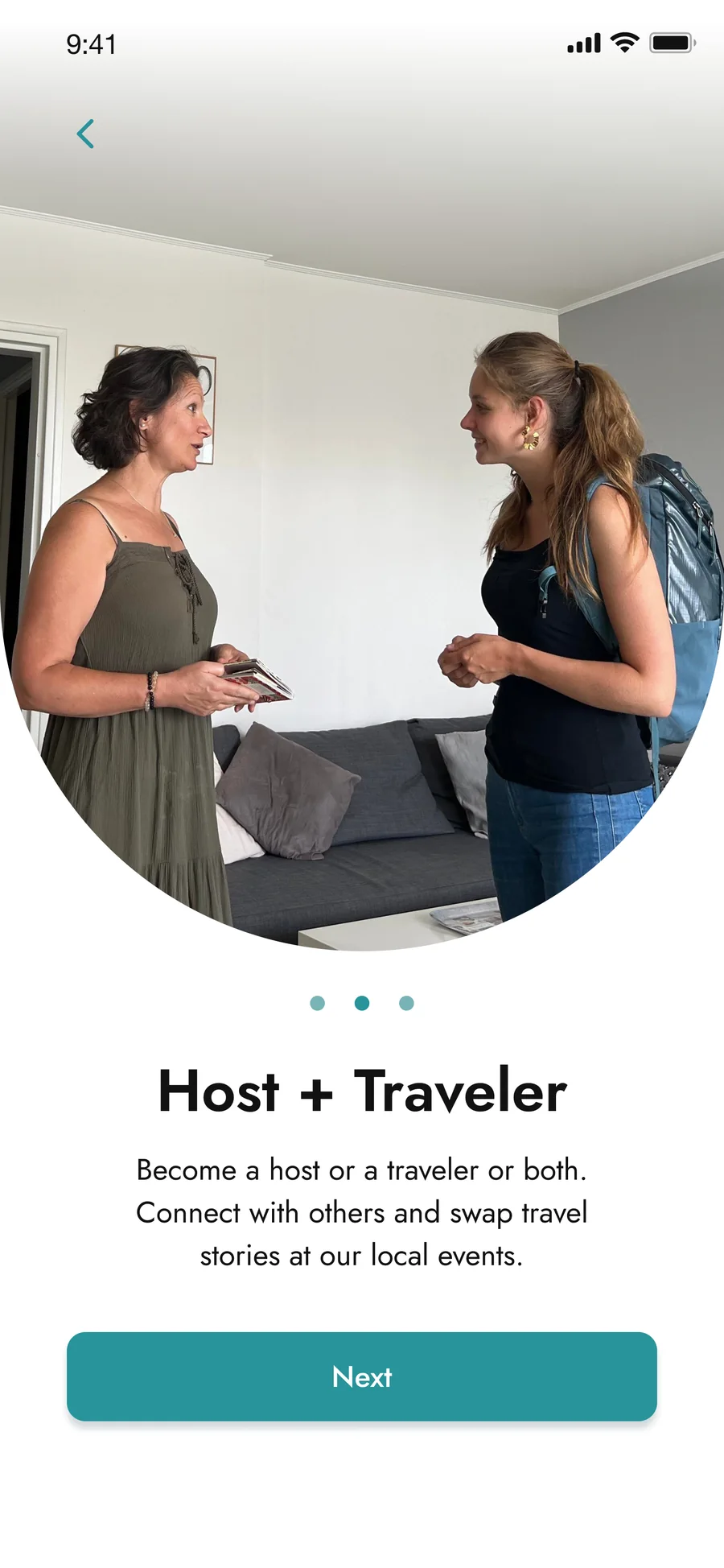
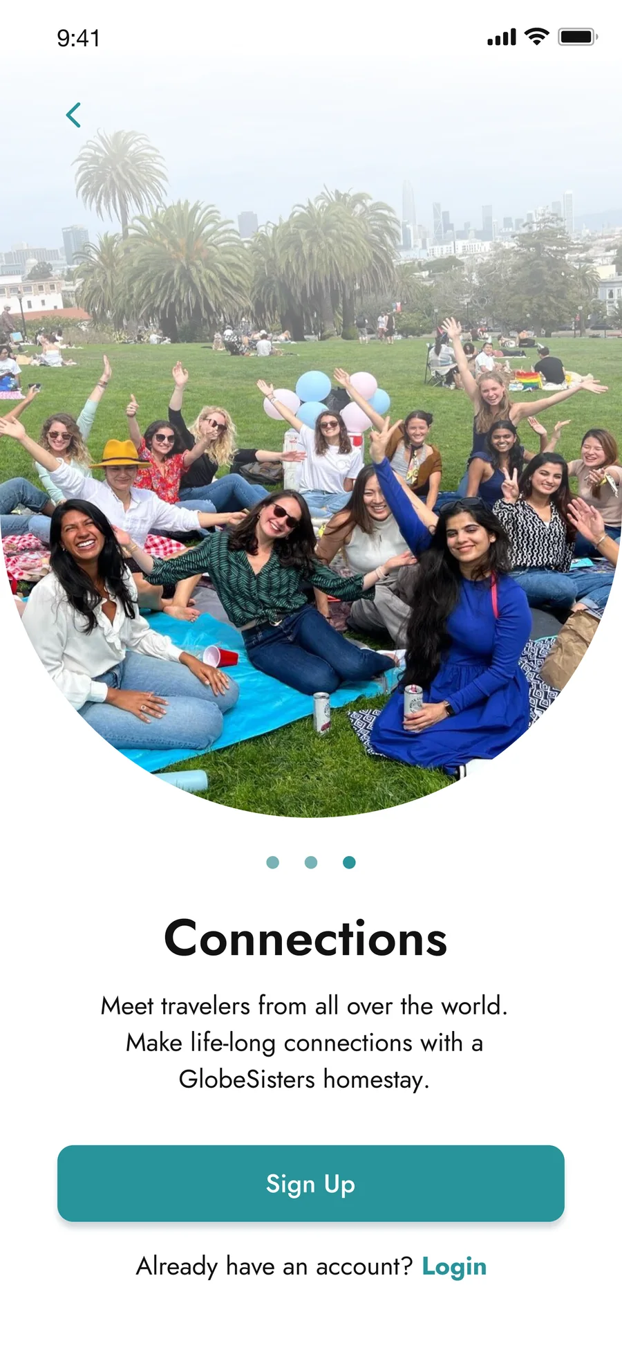
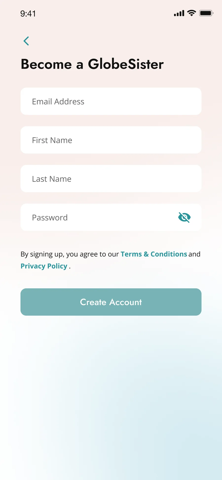
Say what it is, and that it’s safe, before asking for anything.
Onboarding now answers the three questions new members asked: is it safe, what can I do, and why would I.
Decision 02 · Discovery
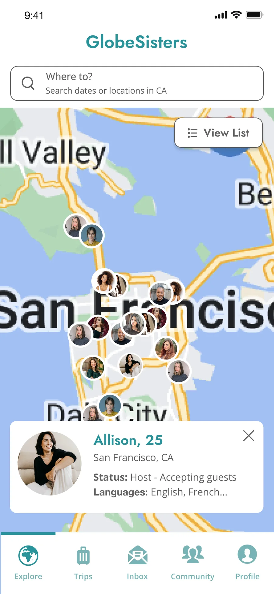
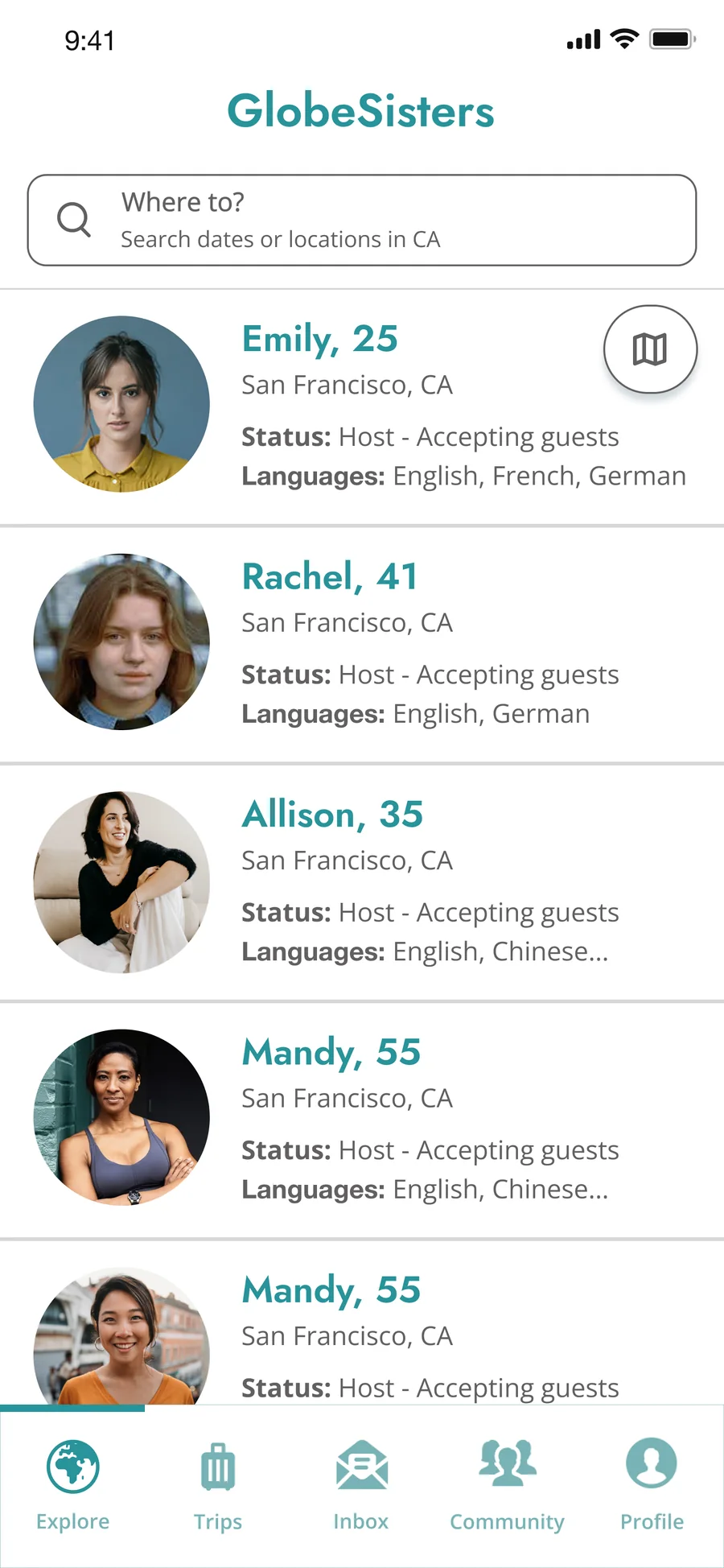
Three ways to find a host, one way to judge her.
Before, the only path was pan the map, tap a face, and open a full profile just to learn if she was hosting.
Decision 03 · Trust, with the team
A trust system, not a trust screen.
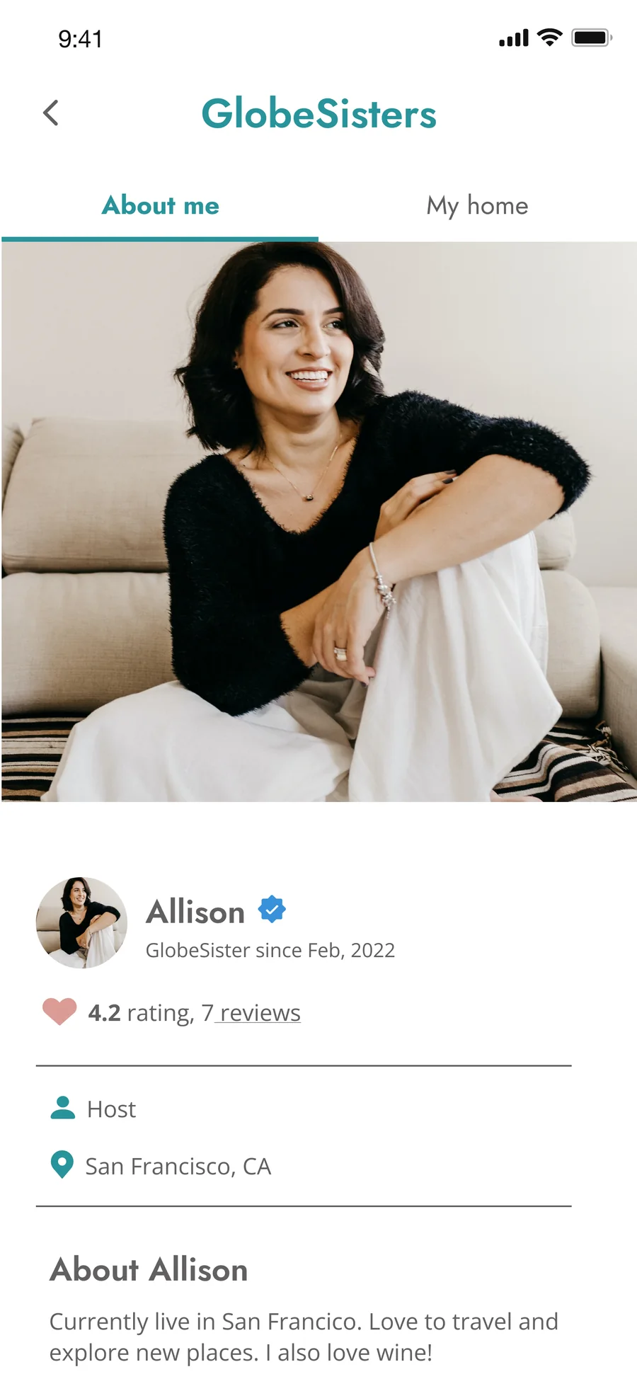
Members decide whether to continue at every step, so every step carries a signal: verification at sign-up, status on the map, proof on the profile, and help if something goes wrong.
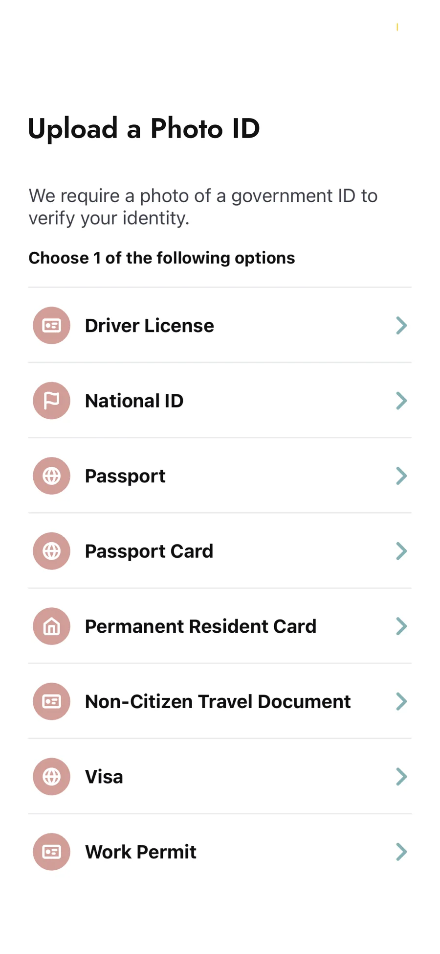
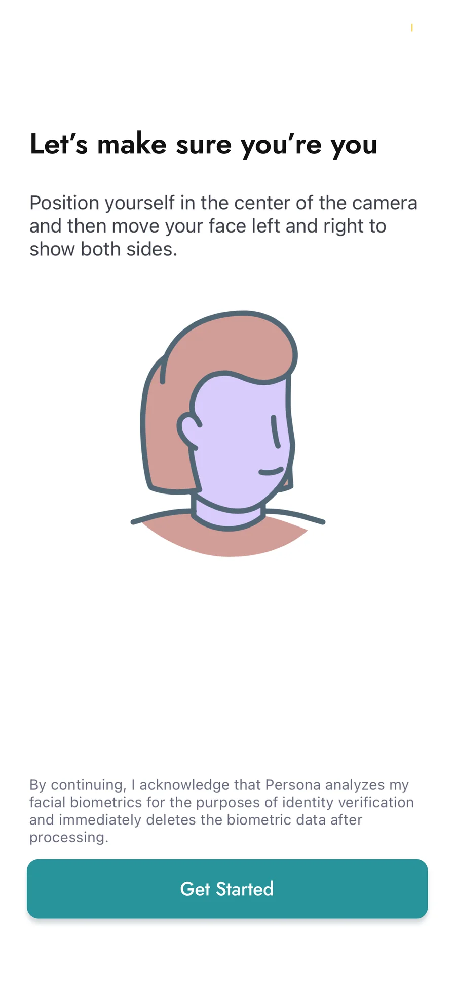
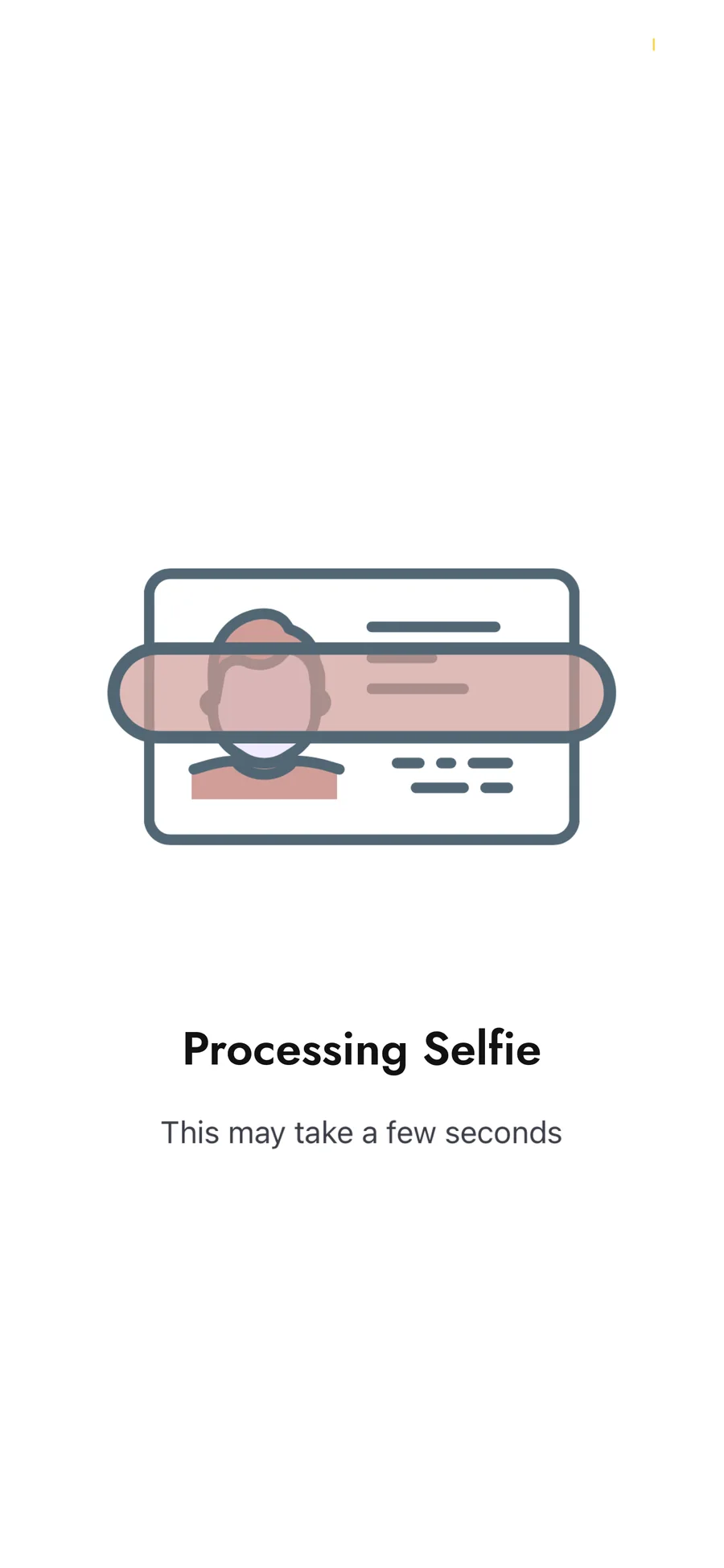
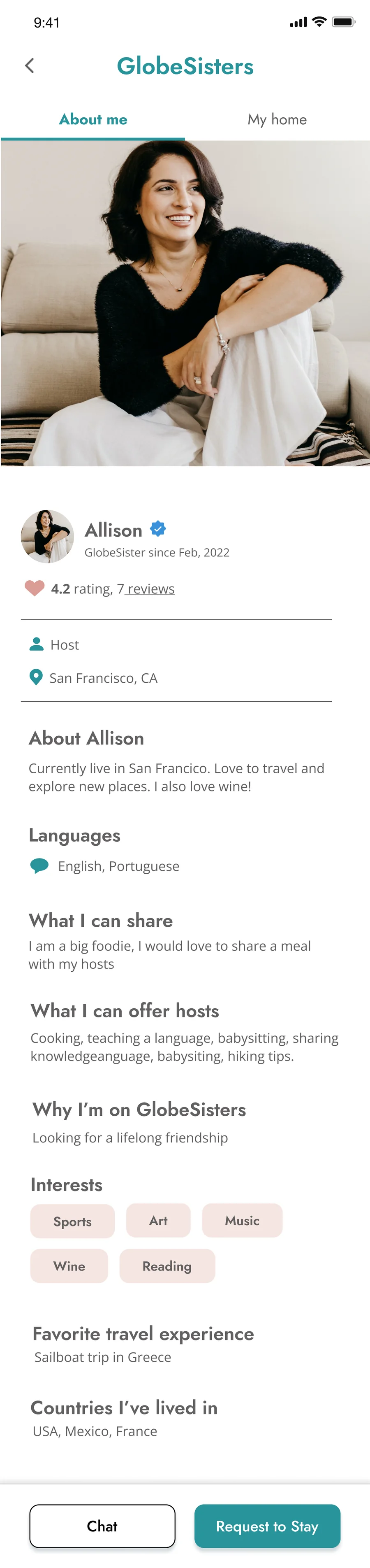

Every path ends on a full profile that answers “who is she, and is her home right for me?” before a traveler sends a first message.
Prototype
Try it yourself.
The GlobeSisters 2.0 file in Figma. Click through onboarding, discovery and a host profile.
Outcome
Launched to the community.
Verified onboarding, three ways to find a host, and safety tools shipped together, so a new member could go from sign-up to a trusted first message. I also translated onboarding and core screens into Russian.
35%
easier to use after the redesign
−20%
checkout abandonment
4 of 5
testers used the new Profile Preview and List View
4–5 min
faster task completion in usability testing
GlobeSisters meetup in Mission Dolores Park, San Francisco.
Reflection
Bring developers in earlier.
Our onboarding animations hit technical limits late. Earlier meetings with the developers would have surfaced that sooner and left more room to design within it.
Look beyond your own product.
Talking to members of another women’s travel community showed that the hardest moment isn’t signing up. It’s sending the first message, so that’s where design has to earn trust.
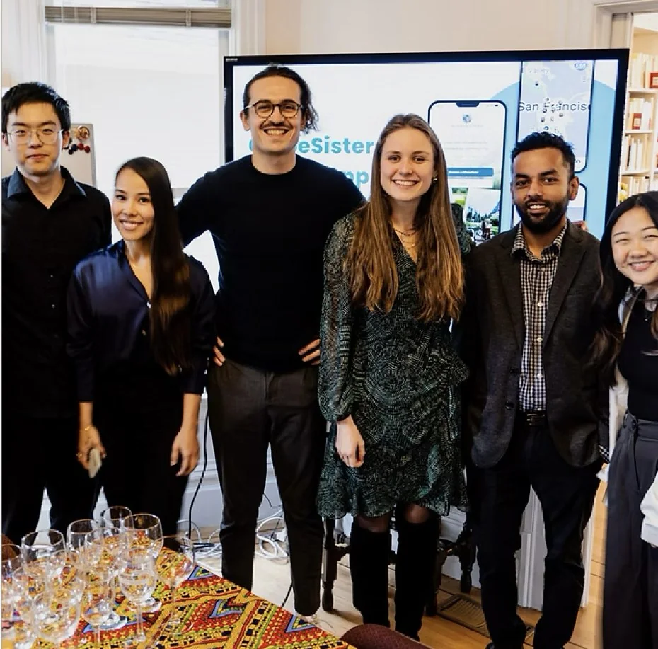
The team at our project showcase

Got a complex product that needs to feel simple? Let’s talk.
Open to product design and UI/UX roles in AI, SaaS and complex workflows. Bay Area or remote.